
The Latest CSS Features Every Web Developer Must Try Out!

Web development has made remarkable strides since the days of plain HTML and basic CSS. With the ever-evolving landscape of the internet, it’s important for developers to stay up-to-date with the latest advancements in technology. One such technology that has seen a lot of growth over the years is CSS (Cascading Style Sheets). Did you know that as of 2022, Javascript and CSS were the most popularly used programming languages? With new CSS features 2022 and looking at the latest CSS trends for 2023, you can truly say that this powerful language has made it possible for developers to create stunning designs and layouts with ease.
In this post, we'll explore the latest CSS features that every developer should know about to improve and enhance their web development skills. These incredible and latest CSS features allow developers to create stunning designs and layouts that were once only possible with complex coding.
Grid Layout: Bid adieu to Boring Web Designs
Using CSS grids and the grid layout comes as a blessing in the world of web design. Developers can create complex layouts using a grid system and the CSS grid table, so you can seamlessly create rows and columns of content, adjust the size of individual elements, and create responsive layouts that adjust to different screen sizes. The result? Say hello to dynamic, eye-catching layouts that capture your audience's attention!
CSS Custom Properties: Work Smarter, Not Harder
Using CSS Custom Properties acts as a secret weapon for web developers. If you're wondering, "Can I use CSS custom properties?" the answer is yes! The function of CSS Custom Properties is to make it easy to define a style variable and use it throughout your stylesheet. This makes maintaining a consistent design across your website easier and saves time by minimizing the amount of code you need to write. This makes it simple to focus on creating great content and leave the styling to the CSS.
Logical Properties CSS: Design for Every Screen Size
With so many different devices and screen sizes out there, it can be a challenge to create designs that look great on every screen. That's where Logical Properties CSS comes in. They permit developers to use logical values instead of physical values when defining styles based on the content flow of the document, rather than the physical layout of the page. Rest assured, you can benefit from responsive, user-friendly layouts that look great on any device.
Scroll Snapping: Smooth Scrolling, Flawless Experience
Scrolling can be a pain, especially on long pages with lots of content. That's where CSS Scroll Snapping comes in. The benefits of CSS Snapping are evident for everyone to see, as it allows you to define snap points that your content will snap to as the user scrolls through your page. This makes it easier for users to navigate your content and creates a more engaging and interactive user experience.
Conic Gradients: Circular Designs Made Easy
Creating circular designs, such as pie charts or circular progress bars, used to be a nightmare. But with Conic Gradients, it's a breeze. The CSS background conic gradient feature allows you to define a color gradient that follows the shape of a circle. The benefits of CSS conic gradients are that they make it easier to create circular designs that look great on any device. Say goodbye to clunky, unappealing designs and hello to stunning, circular designs that are sure to impress your audience!
Parent Selector :has
The CSS :has selector helps you select elements that contain elements that match the selector you pass into the :has() function. It’s essentially a “parent” selector, although far more useful than just that.
Here is a CSS Parent Selector Example to help you understand better:
/* Selects an h1 heading with a paragraph element that immediately follows the h1 and applies the style to h1 */
HTML
<section>
<article>
<h1>Morning Times</h1>
<p>Lorem ipsum dolor sit amet, consectetur adipiscing elit, sed do eiusmod tempor incididunt ut labore et dolore magna aliqua.</p>
</article>
<article>
<h1>Morning Times</h1>
<h2>Delivering you news every morning</h2>
<p>Lorem ipsum dolor sit amet, consectetur adipiscing elit, sed do eiusmod tempor incididunt ut labore et dolore magna aliqua.</p>
</article>
</section>
CSS
h1, h2 {
margin: 0 0 1.0rem 0;
}
h1:has(+ h2) {margin: 0 0 0.25rem 0;}
Container Queries:
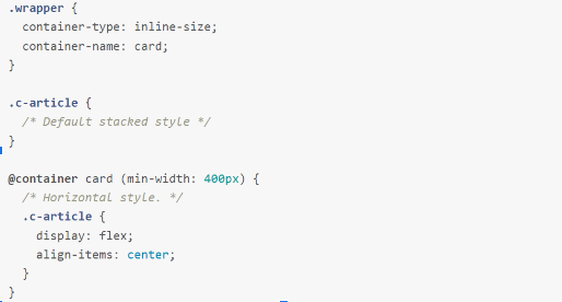
The CSS Container Query allows you to add styles to elements, like font sizes, colors, and layout widths, based on the parent container. This is a whole new approach to responsive design, which formerly relied on the viewport size. With CSS Container Queries, you can write styles that adjust based on the size of the containing element, instead of the size of the screen. This allows for more precise and flexible control over your layout.
The function of CSS Container Queries is to provide a way to create responsive designs that respond to the size of the containing element, rather than the viewport size. This allows designers to create more modular and reusable components, and to fine-tune the layout and styling of elements based on their context within the page.
Syntex:
To query a component based on its parent width, we need to use the container-type property.
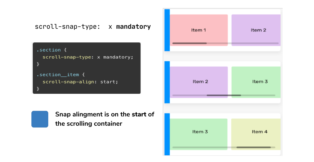
Scroll snap:
The CSS Scroll Snapping feature allows us to create a scrollable container or element without using JS or plugins. Here is a CSS Scroll Snap example: Suppose we want to create slider components in a simpler way without using JS. We can easily do it, thanks to CSS scroll snap.
With the rise of mobile and tablet devices, we need to design and build components that can be swiped with touch. Take, for example, a gallery component. The user can easily swipe left or right to see more images, rather than following a hierarchical structure.
CSS Scroll Snap Syntax:
To use scroll snap on a container, its child items should be displayed inline.
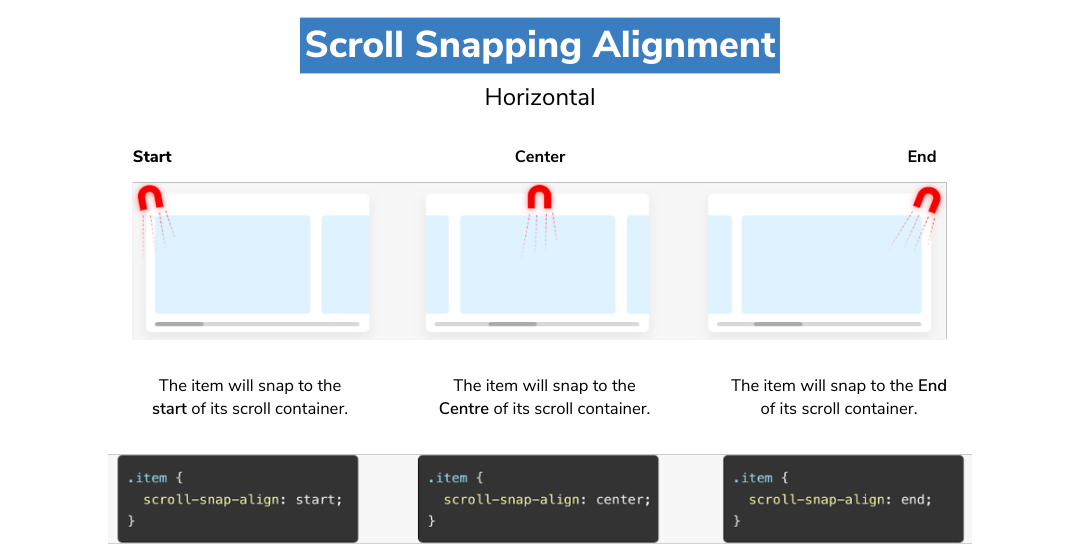
The strictness of a snap can be defined by using the scroll-snap-type property.
CSS Accent-Color:
Some display elements are traditionally difficult to style despite being commonly used. Checkboxes and radio buttons, for instance, are often replaced with a custom widget that mimics the behavior of these elements while hiding the browser’s implementation. The new CSS accent-color option allows you to target these elements.
Here’s an example of CSS accent-color:
We could apply a magenta color to all the radio buttons on your page
<style>

input[type="radio"] {accent-color: magenta;}

</style>
In conclusion, these latest CSS features in 2023 have been game-changers in the world of web design. CSS Container Queries, along with other new features like Logical Properties, Scroll Snap, and Masonry Layout, are making it easier than ever to create responsive and engaging web experiences. With these tools, designers and developers can create complex layouts, animations, and interactions with less code and more flexibility. As web technology continues to evolve, we can expect even more exciting developments in the world of web design and the latest CSS features will help designers to create new and innovative web experiences.
Try out these new features in your next project and see what you can create! Contact our web development experts today and let us help you create engaging and responsive web experiences that will delight your users. Whether you need a new website, an update to your existing site, or help to implement the latest CSS features, our team has the skills and expertise to help you achieve your goals.


DRUPAL: The CMS you must be looking for!
Culture & happiness in SJI